 Yep, it's a DVD box. If you can think of a funny caption for this picture you should probably start your own blog... dick.
I can't watch terrible movies every day, so why not do something popular to blogs everywhere involving almost no effort? A list of stupid things! All right! Here we go!
There's a lot of terrible DVD covers and posters out there, for great movies and terrible movies alike. These can fall into a few categories: floating heads, terrible photoshops, or just all around bad layout.
Take the European release of Children of Men for example.
 The layout and the colour are pretty bad, and what's going on with Clive Owen's eyes? I've heard a lot of people complain about the North American Children of Men cover, but at least it was simple, and the colour scheme representative of the movie's actual texture.
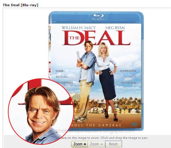
This one is just straight up terrible photoshopping. Looks like they're trying to paste William H Macy's face on somebody else's head. The “Loser...Schmoozer” lines are pretty hilarious too.
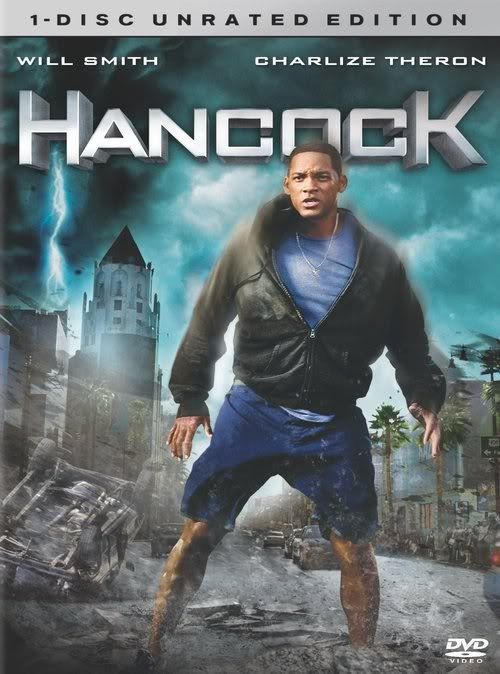 This is one of my favourite things in the world. “1-Disc Unrated Edition!” I think a better marketing strategy would have been to just go ahead and call it the “Unrated Edition,” not brag about the fact that it includes the absolute minimum amount of DVDs needed in order to be sold. But hey, I'm not paid to make DVD covers, I'm just a guy who sits in his basement making fun of other people's hard work, so what do I know, really.
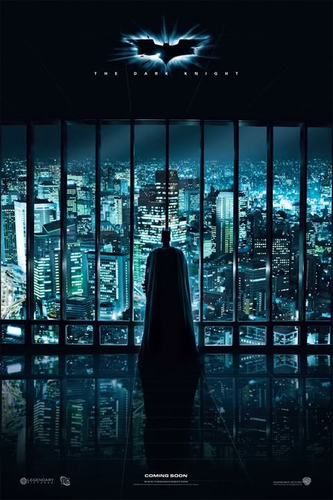 Two things wrong with this photoshop. One of them doesn't matter and one of them does. First of all, that's not how reflections work. We can tell from the level of the horizon and the level of batman that he's in a tall building of his own, so the refection on the floor should be of the sky, not the city. Second of all, Batman's staring at a giant black post.
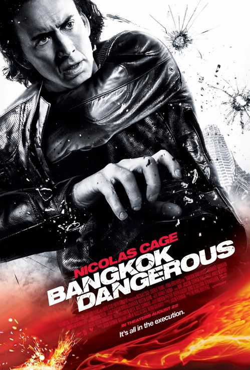 Three things I know about this graphic designer:
- He likes fire.
- He doesn't know how arms work, so he probably doesn't have arms of his own.
- He's anti-gun, so he refused to photoshop a gun into Nicolas Cage's hand.
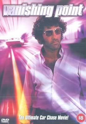 Vanishing Point took a bit of a strange turn on its international release. Purple was an odd colour choice for an action movie about driving a muscle car across America. I like that they've included an actual “vanishing point” around the car, though. Anyway, this cover is the one I have and it's way better.
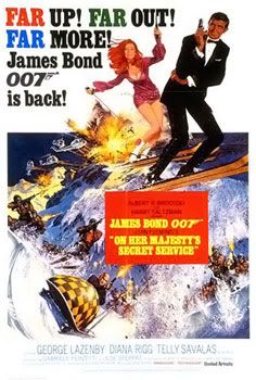 Here's an old one. On Her Majesty's Secret Service is one of the three James Bond movies I've actually seen, it's pretty awesome. But it's funny that in an age before photoshop people were still making the same kind of mistakes. That's not how skis work.
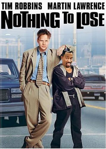 Clearly the graphic designer mistook Martin Lawrence for a ten-year-old and photoshopped him as such.
 Seriously guys, either take a few online photoshop tutorials or just go back to painting movie posters like you used to, those always look better anyways.
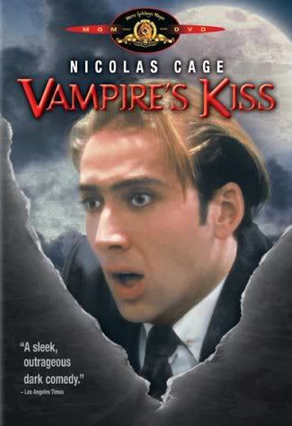 I guess once you've hired Nicolas Cage for your low budget vampire comedy you can't afford to spend more than three seconds working out the DVD cover design. Makes sense.
 Three pictures of Forest Whitaker? I would have been happy with one, but yeah, mathematically this should be about three times more awesome.
That was fun! I should do this again some time. Making fun of DVD covers is like shooting babies in a barrel, except without an erection.
 people think this blog is the bee's vagina.
Hollywood would be a better place without Nicolas Cage.
ReplyDeleteAMEN TO THAT!
ReplyDelete"Second of all, Batman's staring at a giant black post." ahahahah so true. How have I never noticed this before?
ReplyDeleteMaybe he's practicing his cross-eyes?
ReplyDelete